Color has the power to shape how we feel, think, and behave. In home design, the colors we choose don’t just reflect our style—they influence our mood, energy, and even how large or small a room feels. Whether you’re redecorating an entire home or updating one room, understanding color psychology will help you make intentional choices that elevate both form and function.
Here’s how to use color effectively in your home to create the perfect atmosphere for every space.
How Color Affects Mood
Colors affect people on both psychological and physiological levels. Warm colors (like red, orange, and yellow) can stimulate energy, while cool colors (like blue, green, and purple) tend to calm the mind and body.
Even neutral colors—white, grey, beige, and black—have emotional undertones depending on how they’re used. Choosing the right color isn’t just about aesthetics; it’s about how you want to feel in the space.
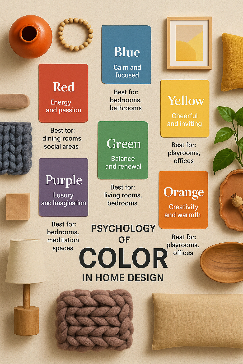
Red: Energy and Passion
Best for: Dining rooms, kitchens, social areas
Red is bold and powerful. It increases heart rate and stimulates appetite, making it a popular choice for dining spaces. It also fosters conversation and energy, making it great for entertaining areas.
Use with caution: Too much red can feel overwhelming or aggressive. Balance it with neutral furniture or use it as an accent (pillows, rugs, a feature wall).
Blue: Calm and Focused
Best for: Bedrooms, bathrooms, home offices
Blue is associated with calmness, trust, and mental clarity. Lighter blues can make a room feel open and airy, while deeper blues bring sophistication and depth.
Watch out for: Cold or sterile vibes. Warm lighting, natural textures, and warm-toned decor can prevent a blue room from feeling too chilly.
Yellow: Cheerful and Inviting
Best for: Kitchens, entryways, bathrooms
Yellow stimulates optimism and energy. It’s bright and inviting—great for areas where you want a fresh, happy mood.
Use strategically: Bright yellow can be overstimulating in large doses. Pale yellow or mustard accents can bring warmth without overwhelming the space.
Green: Balance and Renewal
Best for: Living rooms, bedrooms, home libraries
Green is the most restful color for the eyes. It symbolizes nature, health, and stability. Because it combines the calming effects of blue and the energizing aspects of yellow, green works well in nearly any room.
Design tip: Use plants to enhance a green palette naturally and add texture.
Orange: Creativity and Warmth
Best for: Playrooms, exercise rooms, creative studios
Orange boosts enthusiasm and excitement. It stimulates activity and encourages social interaction. Soft terracotta tones can feel grounded and cozy, while bold oranges are energizing.
Balance tip: Pair with earthy materials like wood or stone for a grounded look.
Purple: Luxury and Imagination
Best for: Bedrooms, meditation spaces, reading nooks
Purple blends the calm of blue with the energy of red. Light purples (lavender, lilac) promote tranquility, while deep purples (eggplant, plum) feel luxurious and mysterious.
Use sparingly: Strong purples can overpower a space. Use as accents or in rooms designed for relaxation or inspiration.
White: Clean and Open
Best for: Kitchens, bathrooms, modern minimalist spaces
White creates a sense of cleanliness and simplicity. It reflects light, making rooms feel larger and more open. In design, white gives you the most flexibility with furniture, textiles, and accent colors.
Important: All-white rooms can feel cold or bland without texture. Add warmth with layered textiles, wood tones, and warm lighting.
Grey: Sophisticated and Neutral
Best for: Living rooms, bedrooms, offices
Grey is a versatile neutral that can feel sleek, calming, or dramatic depending on its undertone. Cool greys lean toward blue, while warm greys have beige or brown hues.
Balance tip: Avoid an overly grey palette, which can feel flat. Add interest with texture, patterns, and accent colors.
Black: Bold and Grounding
Best for: Accent walls, dining rooms, dramatic spaces
Black adds depth, elegance, and drama. Used thoughtfully, it grounds a space and enhances contrast. A black accent wall or furniture piece can add instant sophistication.
Caution: Too much black can make a room feel small or dark. Pair with light colors, mirrors, and metallics to keep the space balanced.
Brown: Comfort and Warmth
Best for: Living areas, bedrooms, rustic or earthy spaces
Brown tones (tan, chocolate, caramel, taupe) evoke comfort and stability. They work well with natural materials like wood, leather, and stone.
Design tip: Combine multiple shades of brown for a layered, warm environment.
Beige: Calm and Adaptable
Best for: Living rooms, hallways, transitional spaces
Beige is a classic neutral that promotes comfort without drawing attention. It creates a soft backdrop that complements nearly any accent color.
Tip: Pair with whites, woods, and greenery for a cozy, modern look.
Color Psychology by Room
Here’s a quick room-by-room guide based on color psychology:
Living Room: Greens, warm greys, beige, and soft blues encourage comfort and conversation
Kitchen: Yellow, white, or muted orange for energy and cleanliness
Bedroom: Soft blues, greens, and warm neutrals for relaxation
Bathroom: Whites and cool blues for freshness and calm
Home Office: Blue for focus, green for balance, grey for neutrality
Kids’ Room: Pastel yellow, soft green, or gentle purple for creativity and calm
Entryway: Warm tones like beige or taupe for a welcoming atmosphere
Dining Room: Deep reds, browns, or dramatic accents like navy or black for intimacy
Lighting Matters
The way a color looks depends on lighting. Natural daylight shows the truest color, while incandescent light brings out warm tones and fluorescent lighting can enhance cool tones.
Always test paint swatches in different lighting throughout the day before making a final decision.
Final Thoughts: Design with Intention
Color is a tool—one that shapes how you feel in your own home. When chosen thoughtfully, it not only enhances beauty but also creates harmony and supports the function of each room.
Instead of simply picking a trending shade, ask:
How do I want to feel in this space?
Let the answer guide your palette and you’ll end up with a home that not only looks good, but feels right.