The rule of thirds is a design principle that originated in visual arts like painting and photography—but it’s just as powerful in interior design. When used intentionally, it helps you create balanced, visually appealing spaces that feel curated and professional.
In this article, you’ll learn what the rule of thirds is, how it applies to interiors, and how to use it to elevate your home styling whether you’re arranging furniture, hanging artwork, or accessorizing a shelf.
What Is the Rule of Thirds?
At its core, the rule of thirds is about balance and composition. It divides a space into nine equal parts using two horizontal and two vertical lines. The four points where these lines intersect are considered the most visually engaging spots.
In interior design, this principle guides how you place key elements so the eye is naturally drawn to them without feeling overwhelmed or bored.
Why it works:
- Creates harmony without strict symmetry
- Keeps the viewer’s eye moving through the space
- Highlights focal points effectively
- Feels organic and thoughtfully designed
It’s especially useful in spaces that feel “off” but you can’t quite explain why.
Applying the Rule of Thirds to a Room
Whether you’re working on a large living room or a compact studio apartment, the rule of thirds can help structure the space.
Examples:
- Divide the wall behind a sofa into three vertical sections: place artwork, sconces, or mirrors at the 1/3 and 2/3 marks
- In an open-plan space, mentally break the room into three functional zones (e.g., living, dining, working)
- Use furniture to visually separate a room into thirds, like a rug in the first third, coffee table in the middle, and sofa in the last third
This approach works especially well in open layouts or spaces that lack natural divisions.
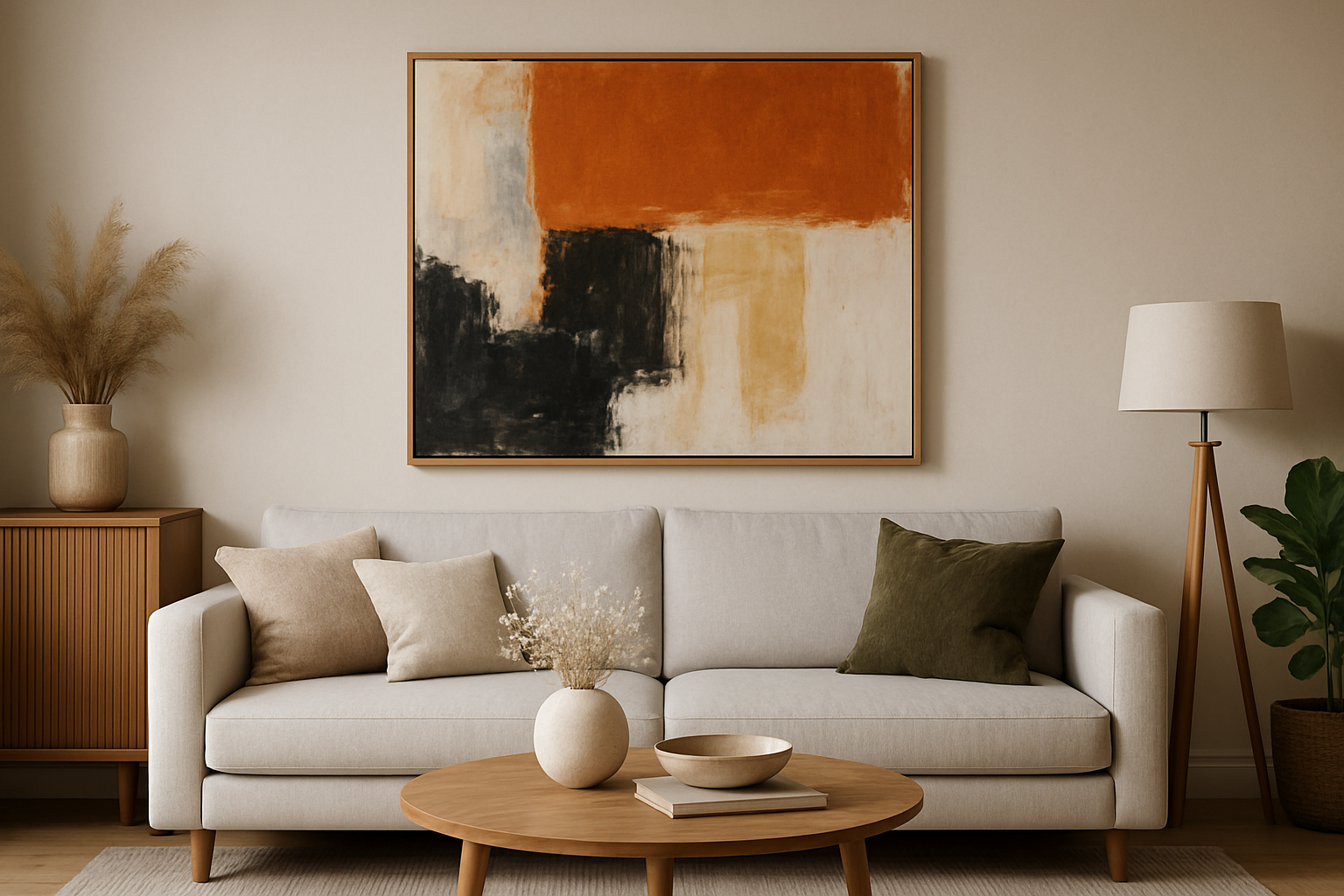
Hanging Artwork Like a Pro
One of the most common uses of the rule of thirds in interiors is art placement.
Tips:
- Hang artwork so the center of the piece aligns with one of the horizontal thirds of the wall
- For gallery walls, position the largest or most impactful piece at one of the four intersection points
- Avoid placing art too high most pieces should sit at eye level, aligning with the top third of the wall
This technique ensures the artwork feels integrated with the room, not floating randomly.
Styling Shelves and Bookcases
Shelves are often overfilled or randomly arranged. The rule of thirds helps you avoid clutter and create rhythm.
Tips:
- Break each shelf into three sections left, center, and right
- Style each section with a different height, texture, or shape
- Use the top third of tall shelves to display lighter or more decorative items
- Leave some negative space (empty area) to avoid visual overload
A well-styled shelf feels like a still life balanced, engaging, and never overwhelming.
Arranging Furniture
When placing large pieces of furniture, the rule of thirds can help guide proportion and layout.
Ideas:
- In a bedroom, position the bed so the headboard aligns with the lower third of the wall
- In a living room, leave 1/3 of the space open for walking paths or breathing room
- When placing two sofas or a sectional, divide the space into thirds for seating, coffee table, and open space
- Use accent chairs or stools at the 1/3 points of a large room to balance visual weight
The goal is to create structure that feels natural not forced.
Layering Decor and Accessories
Even when styling surfaces like coffee tables or consoles, thirds can guide your layout.
Surface styling tips:
- Divide a long console into three distinct styling zones
- On a coffee table, group accessories in threes: a tray, a stack of books, and a small plant
- Arrange throw pillows so they’re grouped in sets of three or follow a 2-1 ratio
- On a bed, place pillows in thirds: two large, one medium, and one accent pillow
Grouping in odd numbers and layering within thirds creates visual tension and depth.
Playing With Height and Proportion
Vertical thirds are just as important as horizontal ones. Using the full height of a wall or room adds drama and balance.
Ideas:
- Hang curtains that start near the top third of the wall to elongate the room
- Place tall mirrors or art to draw the eye upward into the top third
- Add lighting or hanging planters that sit in the upper third of the space
- Stack decor items so the tallest element sits around the 2/3 height mark
These vertical guidelines help you use space more effectively.
Using Color and Texture Strategically
Color blocking or textural changes can follow the rule of thirds to make a room feel layered.
Examples:
- Paint the bottom third of a wall in a different color to ground the room
- Use wainscoting or paneling up to the 1/3 mark for architectural interest
- Hang art or install a mirror starting at the middle third
- Vary rug, fabric, and decor textures from one third to the next for a layered look
Using thirds helps keep strong visual changes from feeling random or disjointed.
Final Thoughts
The rule of thirds is a subtle but powerful tool in interior styling. By dividing your space into three equal parts and placing key elements at intersecting points, you create a room that feels balanced, harmonious, and engaging.
You don’t have to follow it rigidly but using it as a guide can elevate your design instincts and give your space that “finished” look professional designers achieve so effortlessly.