Neutral colors are often considered the safest bet in home decor but they also run the risk of feeling bland or uninspired when not used thoughtfully. The good news? Neutral doesn’t mean boring. In fact, a well-designed neutral space can feel layered, luxurious, and incredibly soothing.
In this article, we’ll show you how to decorate with neutral tones in a way that’s interesting, dynamic, and far from dull. Whether you’re styling a minimalist space or creating a cozy retreat, these tips will help you make neutrals work beautifully in your home.
Understand What Counts as a Neutral
Neutral colors are shades that lack strong chromatic content. They’re versatile and often act as a backdrop for bolder elements but they can also take center stage when layered creatively.
Common neutral tones include:
- White and off-white
- Cream and ivory
- Gray and greige
- Taupe and beige
- Brown and tan
- Soft blacks and charcoals
These shades vary in warmth, undertone, and saturation, which gives you plenty of room to experiment.
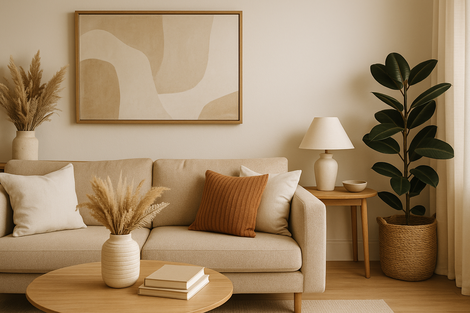
Layer Different Shades of Neutrals
One of the best ways to make neutral decor feel alive is by using layers of tone-on-tone color. Mixing various shades of the same hue adds visual depth and avoids flatness.
Example:
- Combine warm whites, beige, and taupe in a living room
- Use light gray walls, medium gray upholstery, and dark charcoal accents in a bedroom
- Mix soft creams with rich camel or espresso tones for contrast
Layering creates subtle complexity that feels elegant and intentional.
Incorporate Texture Generously
Texture is the secret ingredient in making neutrals feel warm and engaging. It adds tactile interest and prevents your space from feeling too uniform.
Ways to add texture:
- Linen curtains, velvet throw pillows, and chunky knit blankets
- Woven baskets, rattan furniture, or jute rugs
- Raw wood surfaces, stone accessories, or ceramic decor
- Leather accents or boucle-upholstered pieces
The more texture you incorporate, the more luxurious and multidimensional your neutral palette will feel.
Play With Contrast
Contrast doesn’t always have to come from bold colors it can come from light and dark versions of neutrals.
Contrast examples:
- Pair white walls with black or dark gray furniture
- Use a light sofa against a dark wood floor
- Add black picture frames or hardware to soft beige rooms
This technique gives your neutral decor structure and helps define the space.
Mix Old and New
One way to avoid a sterile look in neutral spaces is to blend modern and vintage elements. This contrast in style adds personality and keeps things interesting.
Ideas:
- A modern white sofa paired with an antique wood coffee table
- A vintage rug with contemporary chairs
- Industrial lighting with soft linen upholstery
Mixing styles brings visual tension, which is key to making a neutral space feel curated and not too matchy.
Add Subtle Patterns
You don’t need bold prints to create excitement. Subtle patterns in similar hues can introduce energy without clashing with your neutral palette.
Examples:
- Herringbone or chevron rugs in tone-on-tone colors
- Delicate floral or geometric patterns on pillows or throws
- Striped bedding in soft gray and white
- Wallpaper with a soft texture or repeating neutral motif
Keep the patterns low-contrast to maintain the calming, cohesive vibe.
Use Natural Elements
Bringing nature into your space instantly adds richness to neutral interiors.
Try:
- Plants with vibrant green leaves (they pop against a beige or white background)
- Wood furniture in warm, natural tones
- Stone decor, such as marble trays or ceramic vases
- Dried florals or pampas grass for soft texture
Natural elements ground the space and make it feel warm and lived-in.
Incorporate Metallics
Metallic finishes especially warm ones like gold, brass, or bronze add subtle glamour and reflect light beautifully in neutral rooms.
Where to use them:
- Light fixtures and lamps
- Picture frames and mirrors
- Cabinet hardware and curtain rods
- Vases, trays, or small tabletop decor
A touch of metallic sparkle elevates your space without disrupting the color scheme.
Don’t Forget Art and Personal Touches
Art is one of the best ways to introduce character to a neutral room. You don’t need bold colors art in black and white or sepia tones can still make a statement.
Tips:
- Use large-scale pieces to break up empty walls
- Choose photography or minimalist line art in neutral tones
- Hang a gallery wall with consistent frame colors for unity
- Incorporate handmade or meaningful items for a personal touch
Art gives your space soul, which is essential in a neutral environment.
Use Light to Your Advantage
Lighting is crucial in a neutral space it defines how the colors appear and enhances their beauty.
Lighting strategies:
- Maximize natural light with sheer curtains or blinds
- Use warm white bulbs to keep the space from feeling cold
- Add ambient lighting like floor lamps and wall sconces
- Layer task, accent, and ambient lighting for a balanced feel
A well-lit room shows off the subtle nuances of neutral colors.
Final Thoughts
Neutral colors offer a timeless, calming, and versatile foundation for any home but it’s how you use them that makes all the difference. By layering shades, incorporating texture, adding contrast, and mixing styles, you can create a neutral space that feels anything but boring.
Remember, decorating with neutrals isn’t about playing it safe it’s about creating a rich, layered environment that reflects your personality in a refined and effortless way.